Information Possibly Outdated
The information presented on this page was originally released on March 6, 2008. It may not be outdated, but please search our site for more current information. If you plan to quote or reference this information in a publication, please check with the Extension specialist or author before proceeding.
Enjoy working with colors, even in gardens
By Norman Winter
MSU Horticulturist
Central Mississippi Research & Extension Center
Understanding colors can really help in creating awesome gardens.
There was something magical about how we got color at the newspaper my family owned when I was growing up. As the pressman made his adjustments -- a little more color here, a little less there -- he achieved what was known as process color.
Every conceivable color came from three primary colors.
In grade school, we learned that the three primary colors are red, yellow and blue. These three colors cannot be created by any combination of other colors. If you do an Internet search on primary colors, you will find even that cannot be agreed upon anymore.
Then there are your computer monitor and television. The primary colors on those are referred to as “RGB,” or red, green and blue. For printing purposes, the three primary colors include yellow, plus two colors that most elementary-age kids have never heard of -- cyan and magenta.
The three original primary colors can be combined to make what is known as the three secondary colors: orange (red and yellow), green (yellow and blue) and purple (blue and red).
The primary colors can be combined with the secondary colors to form six tertiary colors: yellow-orange, red-orange, red-purple, blue-purple, blue-green and yellow-green. Understanding the tertiary colors is the key to creating the most stunning gardens.
These 12 colors make up the artist's color wheel that has become a standard in flower garden books. As you start to work with your flowerbed this spring and think of the color options, there is really no need to stress. There is no magic to creating a professional-looking bed with dazzling flowers. Just keep in mind a few basic schemes.
Monochromatic color scheme…
One easy plan is the monochromatic color scheme. This combines blends of the same color, much like the method some guys use when getting dressed. We blend and hope we didn't make a mistake in the process. The monochromatic color scheme is a foolproof way to avoid mistakes in the landscape. It is also absolutely guaranteed to make you look like you knew what you were doing. In fact, many of your neighbors will suspect you broke down and hired a professional landscaping firm.
“Aren't single-color plantings boring?” you may wonder. You should get that out of your head. You may opt for blends of the same color, but this doesn't mean you use all of the same flower. Plan on using as many heights, shapes and textures as possible.
Analogous color scheme…
The analogous color scheme uses colors next to each other on the color wheel. Typically one color is more dominant. Red and orange, orange and yellow, or yellow and green are examples of this scheme. As you pick your colors, make sure there is adequate contrast between the colors. This scheme is not rigid in that colors do not have to be exactly next to each other on the color wheel -- just very close.
Complementary color scheme…
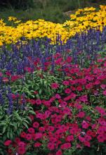
Have you ever said about a couple, “Don't they complement each other?” In other words, they are quite different, but they bring out the best in each other. This scheme is all about contrast. The differences that each flower or plant brings creates the appeal of the combination. In creating a complementary color scheme, one color comes from the hot side of the wheel and the other is its direct opposite from the cool side. Examples are red and green, orange and blue, yellow and violet.
An exciting variation on this is called the split complementary color scheme. After the dominant color is chosen, colors next to the direct opposite are selected. This scheme gives you an extra color along with high contrast.
Triadic or quadratic color scheme…
As you get more comfortable with the combinations, consider picking out multiple colors -- three or four -- that are spaced an equal distance apart on the wheel. This scheme has strong contrast but preserves balance and color vibrancy. It's not as contrasting as the complementary scheme, but it's close. It does exhibit more balance and harmony. These schemes give you not only more color, but more opportunity to use a variety of plants.


